Designing Accessibility is NOT About Us vs. Them
This Rubik's Cube "for the blind" has gotten a lot of blog attention lately:
There's just one problem. It's not really for low vision users. Many low vision users may not read Braille at all, but instead use magnifying devices to blow up what they see.
Others may have never learned Braille (because they lost sight after school, for example) and with audio technologies may not have needed to learn it.
Still others are color blind.
Great accessible design helps everyone, without hurting anyone.
How would I design a Rubik's Cube for the visually disabled? I would put the Braille AND a black text label on the already existing color blocks. Then everyone can use the same Cube.
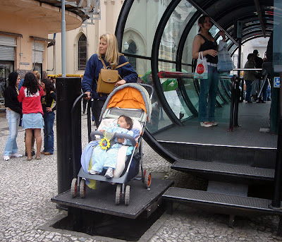
THIS is great accessible design:
Easy to use, not labeled and stuck to the side (I've heard text-only websites disparaged as the "Section 508 ghetto" by disabled users!), not inferior, not different... just more useful, in the end, for everyone. A wheelchair user could use that lift, but so could an overburdened shopper, or just someone who had had a really long day.


No comments:
Post a Comment